The Colour Wheel: Monochromatic Design
- Evie Polkadot
- Apr 26, 2022
- 11 min read

The Colour Wheel was invented in 1666 by Sir Isaac Newton and is used to determine which colours work well together by showing the relationship between colours. This is called 'colour harmony' and can be found by using various 'colour combinations'.
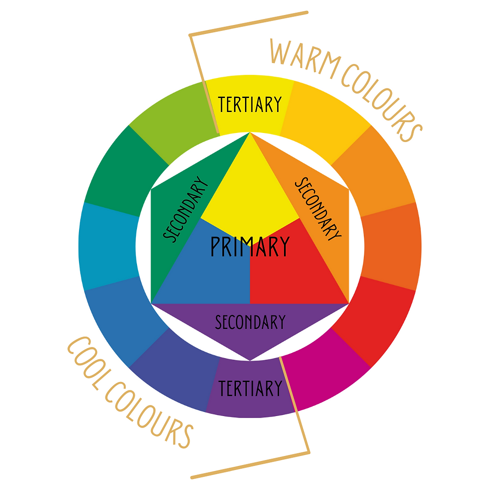
The wheel is split into three categories: primary, secondary and tertiary; with one side displaying warm colours and the other showing the cooler side of the spectrum.
These colours are then used in various combinations, which are determined by the relative positions of different colours on the wheel and are used to find colours which compliment one another, so that your palette is pleasing to the eye.
The combinations typically used are as follows:
Monochromatic
Monochromatic style is achieved by using one colour in various shades, tints and tones in order to create a harmonious atmosphere. This is my absolute favourite style and is the theme for today's blog, so we'll talk more about this in a moment.
Complimentary
Using two colours which sit opposite one another on the wheel, you can achieve a bold and bright design, with each colour enhancing one another's pigment.
Split Complimentary
Using one colour from one side of the wheel, with the two colours sitting either side of the opposite colour to the first.

Analogous
Three colours sitting side by side on the colour wheel make up this combination. This works well, but can be a little overwhelming. To make this combination work best, choose one as a dominant colour and use the other two as accents.
Triadic
This is made up of three colours, evenly spaced on the colour wheel, creating a bold and bright design similar to the complimentary colour combination, only with less impact.
Tetradic
Made up of four colours, evenly spaced on the colour wheel, the Tetradic combination is very bold and works best if one colour is dominant, while the rest are accents. The more colours you add to your palette, the harder it will be to balance them.


Shades, Tones & Tints
Tint: The addition of white to a colour in order to lighten.
Shade: the addition of black to a colour in order to darken.
Tone: the addition of grey to a colour.
So, now I've told you that bit, let's move on to my favourite colour combination and design style - monochromatic colour palettes.
Monochromatic Design
As previously stated, monochromatic design takes one colour in the colour wheel and uses its various shades, tones and tints to create a depth of visual interest; layering the variations of this colour by using different patterns and textures adds a sumptuous, cocooning feel to a space and, when used with dark colours or jewel tones, can make a room feel mysterious and romantic.
Add to this a bold accent colour for a fun pop of contrast, or a metallic element, such as gold, for an added touch of class and elegance.
Monochromatic Bedroom
Everybody has seen my monochromatic dark blue bedroom at home. Photos of this room are always my most popular on social media and it has been featured in magazines and a book.

This room was the first room I decorated when I moved into my home in 2019 and I knew exactly what I was going to do the minute I walk into the big magnolia space; with its tall walls, high ceiling and lots of natural light, I knew it could handle the colour I had planned for it.
I had long been in love with 'Inchyra Blue' from Farrow & Ball and had previously found a similar shade of blue paint I had used to paint the wooden furniture in - 'Homestead Blue' by Fusion Mineral Paint. This is a luxurious, velvety navy that still makes me smile every time I look at it; the mixture of gold handles I have used on the furniture always bounce light, making them look like precious jewels against the darker blue shadows which form at different times in the day.

I had already started down the route of peacock blues, having previously re-upholstered and embroidered a headboard in teal velvet and beaded peacock feathers; and I already had a dark teal rug and teal and gold curtains, along with a small collection of bird-related prints and peacock feather room accessories dotted around the place. So, the theme of the room was already in progress.
I decided I was going to paint the entire room the same shade of blue as the furniture - walls, woodwork, the radiator and the ceiling. Everybody told me I was mad - that the room would look too dark and smaller; I said, 'pish'! I wanted an entirely blue room and that's what I was going to create!
So I set to work; I settled on 'Dark Blue Spruce' from Valspar and painted everything; and once the furniture was in place, the rug was down and the curtains, up, the room really started to come together.
I then chose two gold chandeliers for the ceiling, gold frames for the walls, and gold accessories, then used gold leaf in the window recesses and on the edge of the door. When the sun hits the windows in the summer, a giant shard of warm, golden light bounces through the room; it;s so warm and uplifting. I also used various other shades of blue and teal in the soft furnishings and artwork, giving the whole room more depth.

The gold really helps to elevate the space, bringing in a much needed brightness and catching the light all around room.

I absolutely love this bedroom; it is, by far, my most favourite project.
To further help you visualise monochromatic palettes, I've created a few design boards in various colours. You can use whatever colour in whichever shade you like, of course, but these are some of my favourite colours to use in a monochromatic scheme.
Green for Serenity
Green is the colour of nature and for this reason, it soothes us, lowers anxiety and helps to keep us grounded.
Using green in any room is a great idea and it's one of my favourite colours of all. Nature never makes a mistake and this is why I use nature so much in my designs and mood boards. It's simply beautiful and inspiring.

In this design board, I've used a pretty sage green leaves and bumblebee print wallpaper with matching hues of paint. I'd recommend painting the ceiling in the paler green and the woodwork and radiators in the darker shade - also using the darker shade for any walls you don't want the wallpaper to cover.
I've then added a green rug, sofa and sideboard and brought in touches of gold in the accessories, artwork and lighting.
This scheme would work well in any room; helping to keep you calm, relaxed and cosy, whatever the weather outside.
Teal for Tranquility
Teal is a great colour for the mind because it combines the psychological aspects of both blue and green and, like green, blue brings us the feeling of calmness.
If you've had a busy or stressful day, coming home to teal will help you to feel a sense of balance and peace, whilst also rejuvenating your energy, so it's a great colour for living spaces, bedrooms and home offices.

In this design, I have used one of my current favourite wallpapers - a beautiful coffee bean print in rich teal and gold/silver, which glistens when the light hits it. It's perfect, because what else rejuvenates us? Coffee!
I've chosen a teal paint, which I'd use on everything else - including the ceiling and then I've included teal furnishings and furniture. A dark wood, or gold would also work great against the moody teals in this scheme.
I've accessorised lighting, artwork and plant pots in teal too, as - for me - you just can't have too much teal! Like my master bedroom above, the gold will give this design an elegant edge and will help to lift the space, letting the light bounce around the room.
Purple for Power
Whether you choose violet, lilac, mauve, heather or lavender, purple hues are linked to power, energy and spiritual awareness. My nan always said purple was a healing colour and lilac was her favourite shade until she died 11 years ago.
Purple was the colour of royalty, the wealthy and those high up in the Church, so it is no surprise that we link it to higher realms of power and luxury; but that doesn't mean we all want to decorate our lounges like our favourite Quality Street (well, not mine... mine was always the orange creme!).

For me, purple is a hit and miss colour; it's so easy to tip the scale into tacky territory with too much of the 'wrong' hue and this is the reason I prefer purple as an accent colour, as opposed to being the main colour in a room.
However, I have managed to create a scheme that I really love here. For me, the balance is just right. Here are my tips for using purple shades in order to get the best results with the nicest feel:
1. Opt for heather, deep plum and musky lilac shades - all purples with high grey and black tones. These shades are much less garish than basic purple and less sickly than bright lilac. They have a more romantic quality and are softer on the senses.
2. Rather than having all the furniture in the same colour palette, choose a few smaller pieces to have in purple, such as the aubergine bedside table I've chosen here. For the rest of the furniture, try using dark wood and/or rattan to break up the scheme a little.
3. I love glass - especially coloured glass - and I tend to use it a lot in my designs. I like the fact that light can filter through it, giving it an extra dimension and this varies the colours even more. I've used glass for the table, the lamp and the pendant light; all in different shades.
4. Add gold! Gold and dusky purples look so lovely together and the gold helps to keep a little class in the purples.
Black for Glamour
Black has long been the colour of glamour, sophistication and formal events; black tuxedos and the little black dress (or ball gown!), for example, often worn to important evenings, such as the Golden Globe Awards, or 'black tie' dinners. Black is sexy, mysterious and alluring.
But black is also the colour of mourning; it is serious - dark and authoritarian - and can come across as cold and scary to some.
Not many people in the past would have been brave enough to paint one wall black, let alone their entire room, but in more recent years, black has become more and more appealing as a colour for interior design and is being embraced by many people, decorating their homes with the joy of black. No longer is black just a colour for goths!

In this design, I've shown you that black doesn't need to be cold, dark, or scary; it can be warm, cosy and comforting, too.
I've chosen a black rattan effect wallpaper - the perfect excuse to hang lots of artwork, trinkets and souvenirs to the wall - as well as allowing your mind to run free with ideas on how else to decorate it, using pops of colour, such as string art, made to look like its pinned into the holes (just an example!).
I've teamed this with a black paint, and a black rug with gold to match the numerous metallic elements in the accessories and furniture. Plants really pop against a black background - they're one of my favourite interior teams; and I've included touches of white to help to lift the space a little more for those who aren't quite ready to use black without its opposing friend.
I love these Fornasetti home accessories and you can find similar black and white themed items from other brands, such as Chase & Wonder, Rory Dobner, or Lauren Dickinson Clarke.
Orange for Optimism
Orange contains the properties of both yellow and red, meaning that it contains many great psychological effects.
Orange is bright, cheerful and bold; it communicates happiness, energy, excitement and strength. It is warm, fun and friendly and expresses abundance. Too much orange, however, can become cheap and childish, so it is important if using orange in a monochromatic design, to choose the right shades, patterns and materials in order to keep it classy and mature.

This deep, burnt orange is perfect for a monochromatic scheme; it speaks a more grown up language and, mixed together with rust brown-oranges and bolder, brighter tones - and even a touch of peach - this scheme manages to keep hold of it's sophistication and style.
I've chosen this beautiful Chinese Toile wallpaper from Cole & Son and teamed it with
this danish PH 5 pendant light, which reminds me of a Chinese Pagoda.
The added greens and teals from the artwork, lamp base and soft furnishings help to tone down all the oranges and break up the scheme's possibility to otherwise be overwhelmingly zesty!
Red for Passion
Red. It is the boldest colour in the spectrum; it demands attention and has the longest wavelength, meaning that it appears to be closer than it is. It grabs us and makes us look at it - and this is the very reason it is used for warning, danger, stop signs, traffic lights and forms of important communication, such as postboxes and telephone boxes.
In interiors, red can be a bit of a marmite colour; it is important to select the right shade if you don't want your decor to look gaudy and cheap. Using highly saturated primary red can work well in small doses, but cover a room in the boldest hue and you risk your home looking tacky.
Red can be sexy; it is the colour of lust and romance; the most desired colour for lipstick, the colour associated with alluring women - the lady in red, red lingerie, love hearts and the beautiful Virgin air stewardesses.
It is also the colour of strength, stamina, courage and rebellion, but it is equally associated to anger, aggression and blood.

For this mood board, I've chosen a bold orange-tone red and paired it with a more muted spice red.
Using neutrals in the prints and a cream voile behind the curtains will help to tone down this scheme; I'd also paint the ceiling neutral, or blue to tie in with the soft furnishings here, which would help to break down the palette a little.
Even I couldn't live with an entirely red room. For me, red is more of an accent colour.

My advise, if you want a monochromatic red space in your home, is to play with the shades, tones and tints to find a shade you really love. For me, primary (pure) red is far too much; I much prefer the reds at the darker end of the spectrum, or those nearing 'pink' or 'coral'.
You can find scales like this online. This one is from colour-meanings.com
Pink for Empathy
Pink is a kind colour; it speaks of nurturing and caring, sensitivity and tenderness. It mixes the passion of red with the purity of white, making it a soft and compassionate colour.

I love this design board! Pink is one of my favourite colours for a monochromatic scheme; it's such a fun and happy colour and it always makes me smile, which is why I used it for my entrance hall (below).
For this scheme, I used a gorgeous chinoiserie wallpaper from Woodchip & Magnolia with two shades of pink paint and multi-pink rugs with touches of teal, lilac and gold which are echoed in the wallpaper print.
I continued the gold with pink glass lighting and side tables and would recommend doing the same throughout the space with more of the same materials.
Pink Hall, Stairs & Landing
When it came to decorating the entrance hall at home, I wanted to make an impact; I always say it doesn't matter whether others love what you've done, or hate it, so long as it makes them say 'wow'!
The entrance hall is the first place people see when they enter your home and it needs to set the mood for the rest of your decor. It needs to be welcoming and it needs to leave a lasting impression (hopefully a positive one!), giving those walking in, a sneak preview of what is to come as they wander through your house.

I chose the absolutely gorgeous 'Pink House Pink' from Mylands of London for my walls and ceiling and contrasted the woodwork with 'Burlington Arcade' - a lovely mid-tone blue (I would have absolutely painted the woodwork another shade of pink if it was entirely up to me!). I then painted the front door and an old dining chair in another lovely pink, called 'Covent Garden Floral' and then accessorised with pink voile curtains, pink glass pendant lighting and lots of pink artwork with accents of gold.
In the hallway, I also chose a two-tone pink wall mural for the largest wall, adding extra impact to the space.
It never fails to get a 'wow' and, so far, nobody has hated it... not that they've told me, anyway!

I do realise that this is technically more of a complimentary scheme than it is monochromatic, but because the majority of this scheme is pink, pink, pink... on that basis, I'm including it as monochromatic! Naughty, or what?! Just ignore the blue!

Rules were made to be broken, right?! And I think the majority of people who decorate their own homes these days have shown that the rule book was thrown in the bin long ago!
We do what we love and take no notice of what others say about it - and that's how it should be in our own homes.
And that's it! My little round up of monochromatic decor!
I hope I've inspired you to try something new, if you've never considered this kind of style before.
Next time, I'll focus on Complementary design; I hope you'll all join me for that!
As always, thank you so much for taking the time to read.
Lots of love
Evelyn M


Comments